Usability Testing
Wild Fork is an eCommerce site specializing in high-quality meat and seafood, averaging 39K sessions daily. They offer a range of products from budget-friendly options to premium cuts.
The Problem
Wild Fork’s eCommerce site had limited insight into what users appreciated about the current experience and where they encountered friction. This lack of understanding made it challenging to prioritize design and development efforts effectively or to set measurable benchmarks for improvement. Without this information, the team risked focusing on areas that might not align with user needs or deliver meaningful impact.
The Goal
The goal of this usability testing project was to gain a comprehensive understanding of user behavior, preferences, and pain points across the Wild Fork site. By uncovering what users liked and identifying critical usability issues, we aimed to:
Provide actionable insights to prioritize workstreams for the eCommerce team.
Establish key benchmarks for improving the user experience, focusing on navigation, checkout, membership benefits, and product discoverability.
Inform a strategic roadmap for design and development efforts, ensuring alignment with user expectations and business objectives.
My Contributions
As the UX Lead, I drove the usability testing initiative by:
Planning and Coordination: Developed the research plan, designed testing questions, and collaborated with marketing to recruit participants, ensuring diverse representation. Scheduled and moderated 11 testing sessions over Zoom.
Leading Research Efforts: Directed the UX team in conducting and analyzing usability tests, synthesizing key insights using Optimal Workshop.
Team Leadership: Managed two UX designers, ensuring consistency across sessions and mentoring them on best practices in usability research.
Cross-Functional Collaboration: Worked closely with the eCommerce, product management, and marketing teams to align research objectives with business goals.
Communicating Findings: Presented insights and actionable recommendations to stakeholders, delivering a prioritized roadmap for improving the eCommerce experience.
Timeline
March - April 2023
My Role
UX Lead
Tools and Methods
Moderated testing via Zoom
Recorded sessions with Optimal Workshop analysis
Task-based scenarios for members and non-members
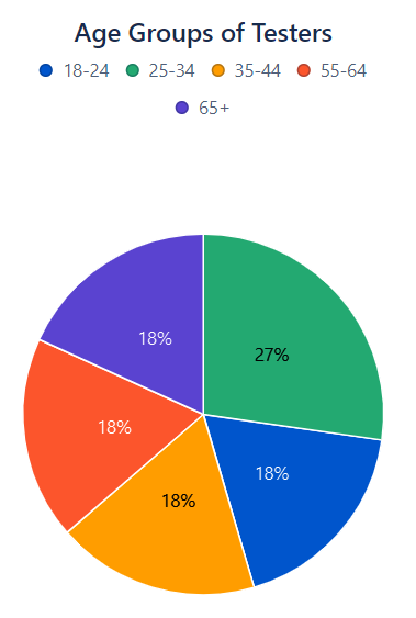
Participants
11 participants (5 members, 6 non-members)
All participants spent a minimum of 20 hours per week online, with most spending over 40 hours.
Preferences for different types of products, representing a diverse set of users.

Process
-
Planning
Designed research questions targeting navigation, membership perceptions, and the checkout process.
Collaborated with marketing to recruit participants representing a diverse range of preferences and behaviors.
-
Execution
Conducted moderated testing sessions with two types of participants: members and non-members.
Tasks included finding products, adding to the cart, exploring membership benefits, and completing a simulated checkout process.
-
Analysis
I led a team of two UX designers in analyzing the findings.
Synthesized findings from recorded sessions and Optimal Workshop insights.
Identified key usability issues and potential quick wins to address user frustrations and created a roadmap for prioritizing high-impact projects.
Key Findings
What’s Working
-
Photography
Users praised the product photography, associating it with high quality.
-
Navigation
Users found product discovery intuitive, particularly when mini navigation examples (like Beef & Steaks) were present.
-
Membership Pricing
Members felt the membership fee was fair, and free shipping was a key motivator for joining.
-
Product Offerings
People view Wild Fork’s products as high quality and know to come to our site specifically for hard-to-find items, such as duck, as well as products at the best price.
Pain Points
-
Unclear Pricing
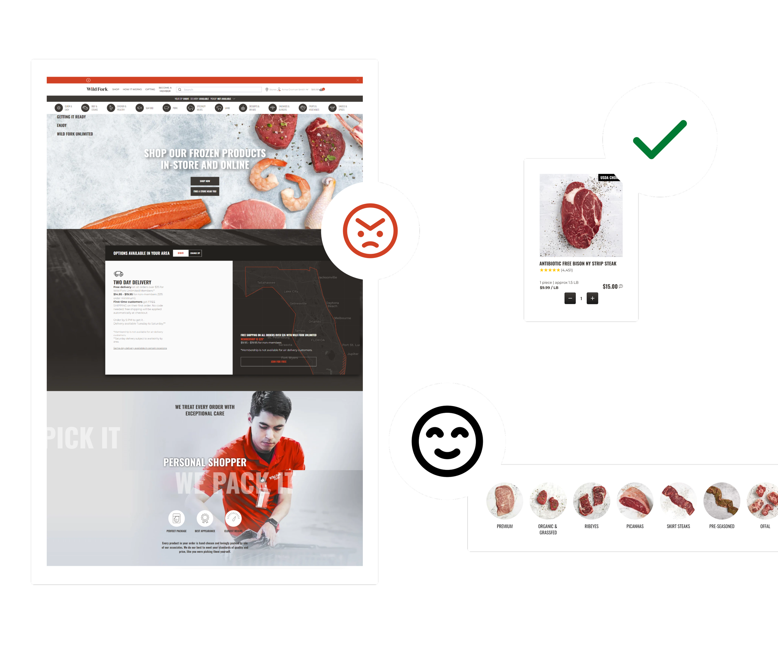
Users found the pricing model confusing, expecting the listed price to match the final checkout price. Users did not understand that some prices are approximate based on product weight.
-
Checkout Process
Too many steps; users often abandoned the process mid-way.
Cart minimum was unclear, and users were unsure of next steps if the minimum wasn’t met.
-
Filters & Badging
Users struggled to find key product attributes (e.g., grass-fed, wild-caught) due to inconsistent badging and confusing filter categories.
-
Gifting Feature
Users were unaware of the gifting option, as it was introduced too late in the checkout process.
“What I am paying when I check out should be what I am paying.”
“This is where I would expect there to be the option to say it’s a gift but it’s not there.”
“I had to click like 7 times to get to this checkout.”
Design Adjustments Based on Findings
-
Transparent Pricing
Added “Approx” before the price to manage expectations.
Ensured the price listed at checkout reflected the maximum possible charge.
-
Streamlined the Checkout Process
Reduced the number of steps with an accordion-style layout.
Allowed saved payment methods to expedite checkout.
-
Refined Filters & Badging
Introduced clickable badges to act as filters for easy product discovery.
Conducted card-sorting exercises to optimize filter categories.
-
Improved Gifting Visibility
Moved the gifting checkbox to the delivery section and surfaced gifting information earlier in the funnel.
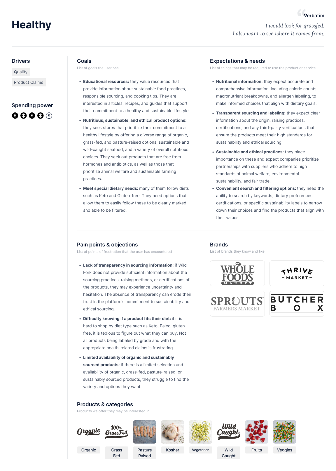
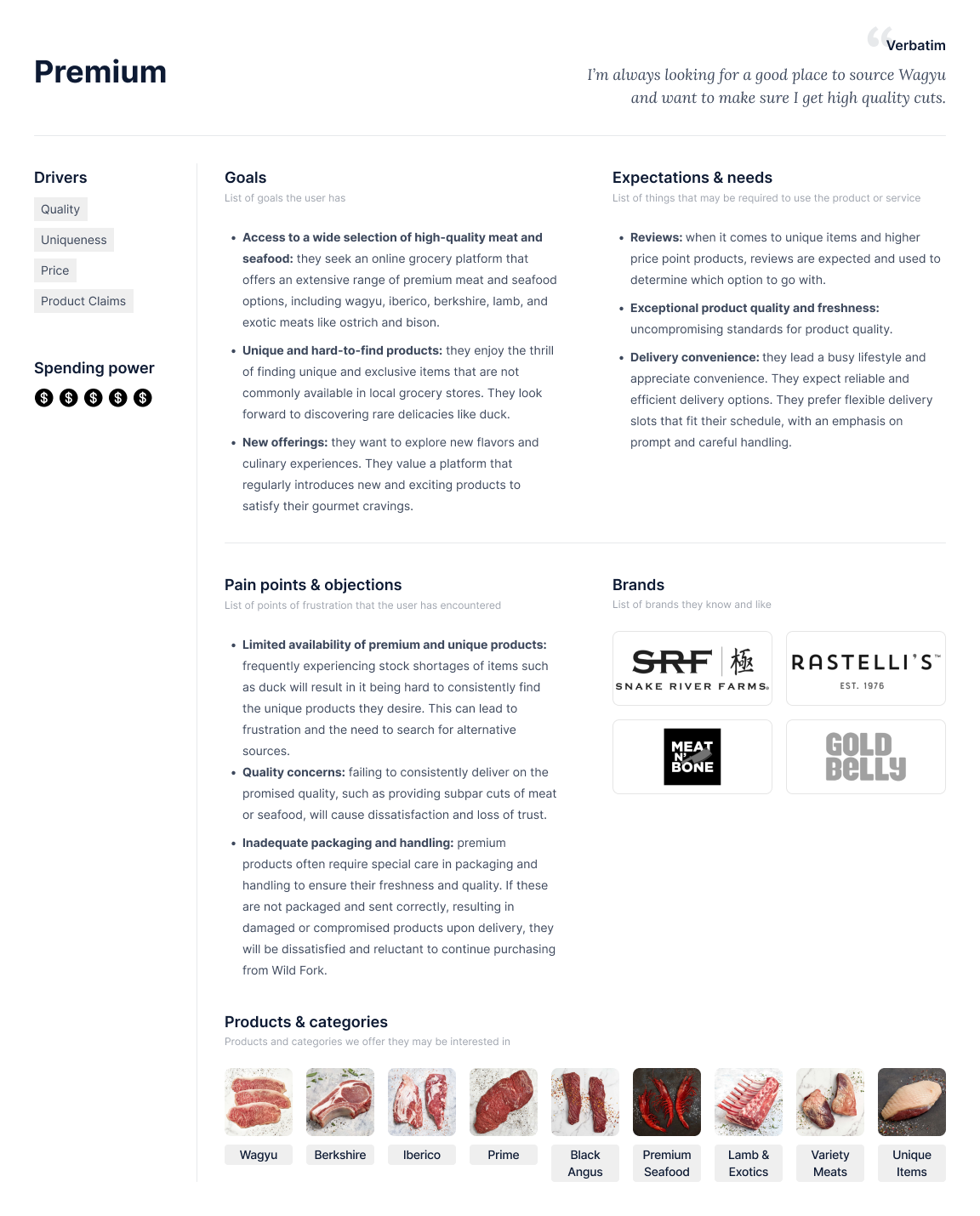
User Personas
Based on the usability testing findings, we developed user personas to represent key customer segments, including both members and non-members. These personas guided the prioritization of eCommerce projects by aligning design improvements with user needs, such as simplifying checkout for time-constrained users or enhancing the gifting experience for thoughtful shoppers.


Outcomes
The findings informed a prioritized roadmap for the eCommerce team, aligning project timelines with user needs and business objectives. As the UX lead, I collaborated with cross-functional teams to ensure these changes were integrated into the development pipeline effectively. The immediate items we worked on from these findings included:
Increased clarity in the checkout process, reducing confusion and potential drop-offs.
Enhanced visibility and usability of the gifting feature, improving user satisfaction.
Improved product discovery through consistent badging and refined filters.
Boosted trust with clearer communication of pricing.
We spun up a series of Dynamic Yield tests to validate some of the findings from these interviews that we considered “quick wins” including:
Listing the origin on PDPs outside of the description to make it easier to find.
Highlighting sourcing, diet, and raising standards, all of which were very important to all users in the interviews, through iconography and badging on PLPs and PDPs. We are currently working on a quiz to help users create a profile that would showcase these types of products they are most interested in.
Changing the “Reorder” button on order history pages to “Add all to cart” as users explained wanting to be able to order most of what they already had, but not using the button for fear of it taking them right to checkout without being able to edit the order and remove any unnecessary items.
Showing reviews higher on the Specialty Meats category to begin. Reviews were seen as incredibly important for these types of products.
Outcome: Achieved a 15% increase in conversions for specialty products, leading to expanded implementation across other product lines.
Displaying bundle savings to help users quickly understand what a deal they are getting.
All in all, these tests helped set benchmarks for the eCommerce team, align on a product roadmap, and helped us better understand our users.