Cart & Checkout Redesign
Wild Fork is an eCommerce site specializing in high-quality meat and seafood, averaging 39K sessions daily. They offer a range of products from budget-friendly options to premium cuts.
The Problem
Wild Fork's checkout flow was overly complex, with multiple decisions and steps spread across separate pages. This complexity, combined with hidden shipping costs and unclear pre-authorized credit card holds due to variable product weights, led to high user frustration and cart abandonment.
The Goal
The redesign aimed to streamline the checkout process, making it more transparent and user-friendly. Key objectives included:
Decrease Cart Abandonment: Target a 20% reduction.
Reduce Customer Support Inquiries: Decrease by 30% regarding checkout issues.
Faster Checkout Completion: Reduce average completion time by 30%.
My Contributions
I led the UX design from research to testing, collaborating with the Product Manager and IT team to ensure successful implementation. My key responsibilities included:
Leading design phases and collaborating on research and analysis.
Creating user flows, wireframes, and prototypes.
Breaking down the project into manageable sections and prioritizing tasks with the Product Manager.
Conducting usability testing and implementing improvements.
Coordinating with the Customer Service team to address issues pre- and post-launch.
Timeline
April-September 2024
Target User
Online meat and seafood purchasers
Immediate Team Size
6 people
My Role
UX/UI Designer
Tools
Figma, Dynamic Yield, Jira, Powerpoint
Discovery
Scope & Constraints
The scope of the project was to redesign the checkout process in phases due to limited development resources, starting with the cart. This staged approach allowed us to test and implement changes incrementally, ensuring each update improved the user experience without overwhelming the development team.
Key constraints included:
Limited development resources necessitating a phased rollout.
The need to balance ongoing site maintenance and other projects alongside the checkout redesign.
Ensuring all changes were backward-compatible and did not disrupt existing functionality.
Team Coordination & Feature Implementation
Collaboration with the IT team was crucial to ensure the designs were implemented accurately.
Regular check-ins and reviews were conducted to address any technical constraints and ensure alignment with the design vision.
Competitive Analysis
Our research focused on identifying best-in-class checkout flows from various eCommerce sites, regardless of product offerings. We leveraged insights from Nielson Norman research and the Baymard Institute to set benchmarks for best practices. Key benchmarks included:
Explicit third-party payment options (e.g., “Continue to Paypal”).
Minimizing forced logins to reduce drop-off rates.
Prominent guest checkout options in tabbed designs (upper left) and mobile (along the top).
Shipping cutoff countdown timers to inform users of delivery windows.
Early and transparent pricing, including shipping fees and temporary credit card holds.
Store pickup options to encourage in-store pickups.
Editable sections in the order review step, allowing in-place edits without sending users backward.
High-level Goals
-
Streamline Checkout Process
Redesign the checkout flow to use an accordion-style layout, reducing user confusion and mental load by making the process more intuitive and efficient.
-
Enhance Pricing Transparency
Surface shipping charges and pre-authorized credit card holds early in the checkout process to increase customer satisfaction and reduce frustration.
-
Boost Conversion and Satisfaction
Achieve a 20% reduction in cart abandonment, a 30% decrease in customer support inquiries, and a 30% faster checkout completion time.
A/B Tests
We ran several A/B tests using Dynamic Yield to determine where our efforts should be focused in the redesign as well as tests to know which design was best. This shows an example of the sort of test we ran.
Cart Flyout vs. Cart Page for Desktop

Cart Flyout
WINNER

Cart Page
Objectives
Determine if it was worthwhile investing in redesigning the cart page, or if focus should be on the cart flyout.
In the live version of the site prior to the redesign, if a user clicked on the cart icon in the header they would see a cart flyout. Within the cart flyout if they clicked a cart icon, they would be taken to the cart page.
Hypothesis
With sites moving away from cart flyouts for products with a lot of options due to the small space real estate, I thought directing users directly to the cart page would be beneficial to help them digest the larger amount of information in a larger space and would result in a higher purchase conversion rate.
Session Details
Participants: 60,205 users
Device: Desktop
Dates: July-August 2024
Outcome
+4.57% uplift in purchases for users being directed to the cart page directly (with no cart flyout).
Based on this, we moved forward with a redesign of the cart page as the main focus.
Design Solutions
To address the pain points identified during the discovery phase, I created wireframes and prototypes incorporating the following design solutions.
We started with simple changes to the cart page, and then moved on to the checkout process. I redesigned the entire checkout, and also provided documentation for ways we could incorporate some of the most impactful changes in the current design at the time so as to have some quick wins. This involved things such as moving checkboxes from one area to another to make it more intuitive for users without needing to have the entire checkout redesign completed first.
Third-Party Payment Clarity
-

Original Issue
When selecting third-party payment options like PayPal, buttons did not clearly indicate that users would be taken to an external site, causing confusion.
-

Redesign Solution
I updated the buttons to clearly state that users would be redirected to an external site, improving user understanding and flow, reducing abandonment.
Guest Checkout Visibility
-

Original Issue
Upon choosing to checkout, the main option was to login, with the guest checkout option not being the obvious visual choice, contrary to benchmarks.
This was a separate page users were brought to first before seeing the expected delivery options.
-

Redesign Solution
Changed the experience so guest checkout is the preselected option.
Removed the separate login page step and instead added this to the top of the checkout flow as an expandable option so a user can choose to login at any point during checkout, but is not forced to make this decision early on, reducing cognitive load and allowing for a speedier checkout.
Delivery Driver Notes
-

Original Issue
Notes for the delivery driver were added after entering the delivery address in a separate step, leading users to use Address Line 2 for custom notes.
-

Redesign Solution
I moved the notes section to the delivery address entry screen, reducing confusion and ensuring proper use of the fields.
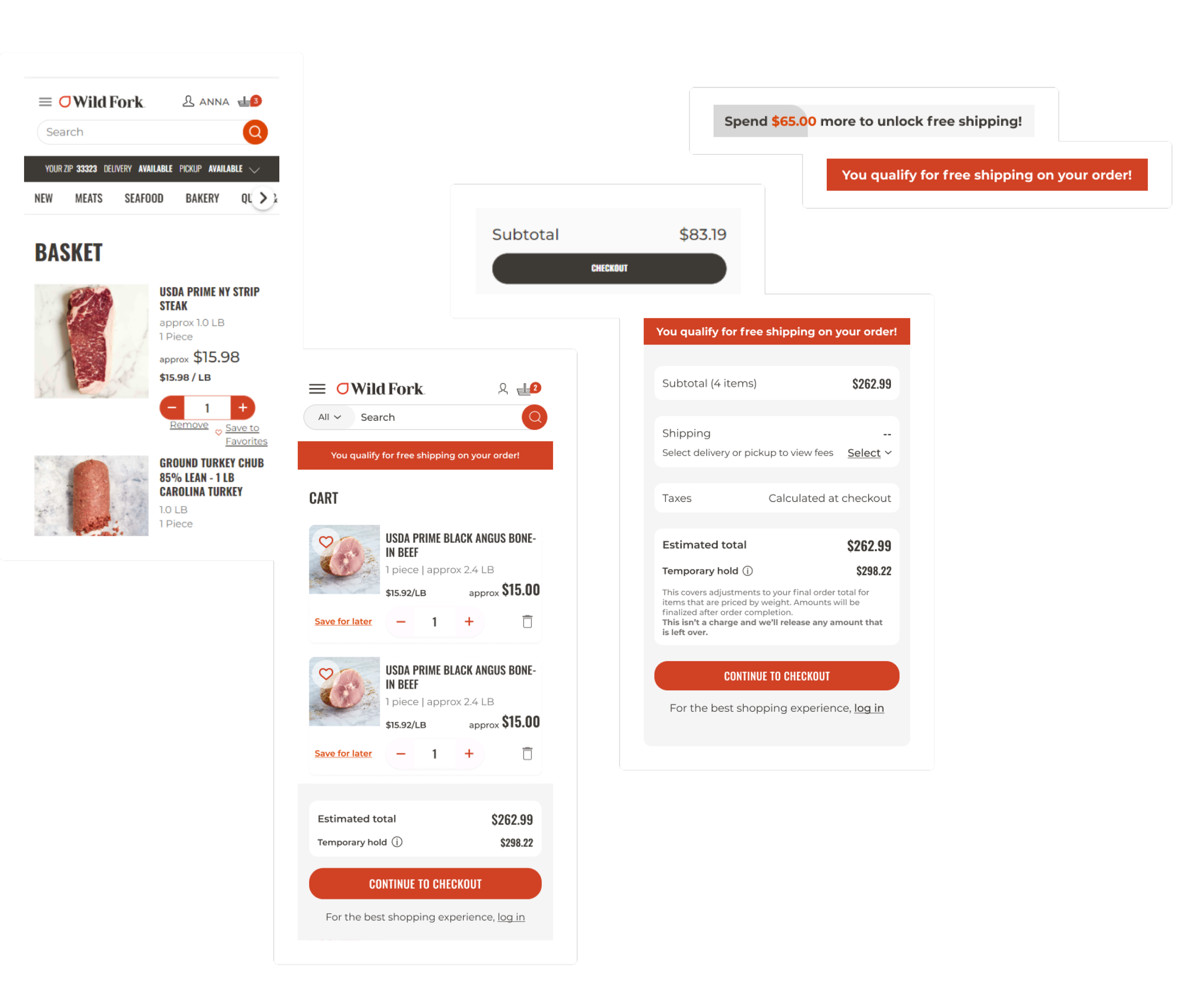
Pricing Transparency
-

Original Issue
The option to send the order as a gift was located after the user entered their delivery address, causing confusion and underuse.
-

Redesign Solution
Added threshold bar to show how far away the user is from reaching free shipping.
Added option to select delivery or pickup so users can see any fees associated on this page instead of later in the checkout flow.
Made the estimated total clear and included any shipping fees.
Surfaced temporary hold amount and explanation.
Changed prompt from continue shopping to prompt to login as the user is ready to checkout at this point.
Gift Order Placement
-

Original Issue
The option to send the order as a gift was located after the user entered their delivery address, causing confusion and underuse.
This was found on a separate step, so a message was added to help reduce confusion but this was not a long-term solution.
-

Redesign Solution
I moved this option earlier in the flow to be selected with the delivery options, increasing its visibility and usage.
Product Card Designs
-

Cart
Original Issue
Although product cards were the same width as the redesigned version, all of the content was pushed to the left, creating a visually cluttered feel.
The buttons and links were too close to one another to allow for easy clicking, resulting in many user errors.Redesign Solution
A more spread out redesign with appropriate spacing for buttons allows users to accurately select the action they want to take. Bringing the quantity selector down to secondary button styling allows the Checkout CTA to stand out.
-

Checkout Sidebar
Original Issue
Pricing was not clear to users. As it was set to appear in a small area on the right hand side of the card, approximate pricing did not have anything to indicate it was not the final price and could vary based on the weight of the product.
Redesign Solution
By spreading out the pricing and having the most important final price appear on the right, we were able to add in “approx” wording to indicate to users when products could vary in price based on weight, reducing confusion and frustration.
-

Order Confirmation Page
Original Issue
The order confirmation page had no product cards, so once a user completed their order they would need to check their email to confirm what they had successfully purchased.
Redesign Solution
We added product cards further down on the order confirmation page so users could easily see what they had purchased, along with the price and quantity for easy reference.
Prototypes
Outcomes
Decrease Cart Abandonment: Target a 20% reduction.
Achieved 21.45% decrease in bounce rate for cart YOY
Increase Conversion Rate: Aim for a 15% increase.
Reduce Customer Support Inquiries: Decrease by 30% regarding checkout issues.
Improve User Satisfaction: Increase positive feedback by 25%.
Faster Checkout Completion: Reduce average completion time by 30%.
