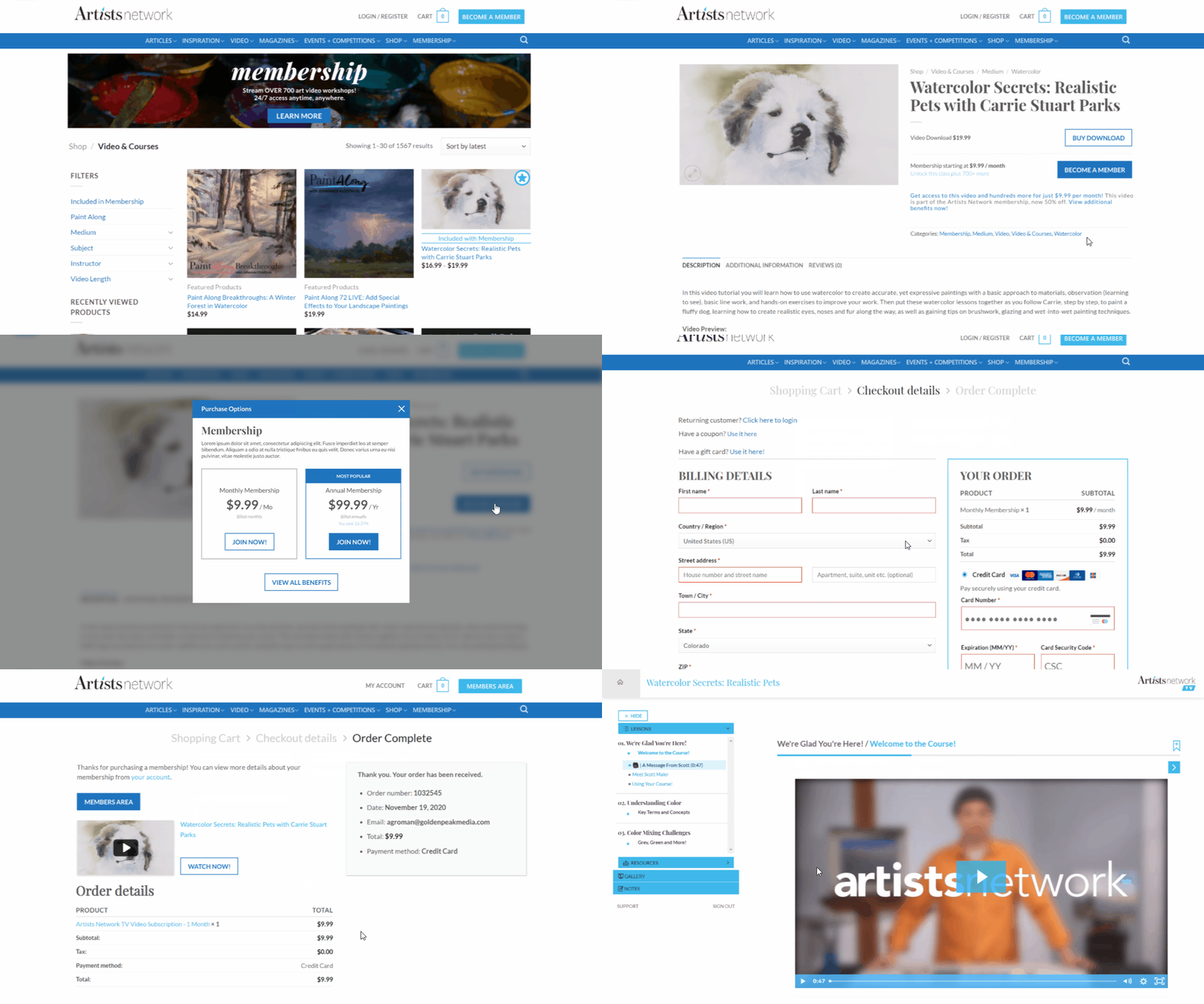
Membership
for Artists
Artists Network is a website averaging 20K+ users daily that helps empower artists interested in a range of mediums including painting and drawing through tutorials, videos, and inspiring articles.
Please note: to comply with my confidentiality agreement, I have omitted confidential information.
The Problem
Artists need a way to build their skills and stay inspired using several different methods as each artist has their own preferred way of learning.
The Goal
The goal of this project was to create a membership option for artists that would allow them to access many skill-building resources in one place including instructional videos, exclusive articles, eBooks, and access to digital magazine archives.
My ConTributions
I coordinated and led all facets of the user experience design including research, analysis, creating flows and wireframes, prototyping, hand-off to the development team, and testing. Additionally, I assisted with front end development as needed.
After MVP launch, I led all usability testing, analysis, and improvements.
Roles & Responsibilities
This project spanned the entire organization with touchpoints across all teams. The Digital Team that I am a part of led the product design and worked closely with the Marketing Team for branded assets and marketing plans for launch. We communicated closely with the Video Team and Product Management Team to ensure correct setup, and continued to work with the Customer Service Team pre and post launch to monitor any potential issues that could arise.
Timeline
2 months: November 2020-January 2021
Target User
2D Artists
Immediate Team Size
6 people
Additional Teams
Marketing, Video Production, Product Management, Customer Service
My Role
User Experience Manager:
Research, Wireframes, User Interface, Prototypes, Presentation & Feedback, Usability Testing
Tools
Miro, Adobe XD, UserTesting, ClickUp, Powerpoint, WordPress, GitHub
Discovery
Scope & Constraints
There was an extremely short timeline (2 months total) that we had to adhere to in order to meet business goals.
The company had signed a long-term contract with a video hosting provider, so the user flows were confined to whatever was possible using this tool which did not allow direct video playback within our website. As such, we had to keep in mind how users would get to this separate platform and come back again to consume more information such as articles, which was in no way ideal.
Many of the features included with the new membership product were already available for individual purchase, however they had very different ways to access them that were causing issues for users. As part of the membership product launch we had to create new user flows for these that would allow users to access them all from one centralized location. As such, we needed to take the following into account:
Past purchases by users and how they would continue to access these
How users would become members
How members would access their included benefits
How users could continue to purchase individual products also included in membership
Competitive Analysis
Our research centered on products from the e-learning field with a focus on recreational skill-building video resources to match our product offerings.
We also looked into online communities aimed at creatives, such as Tumblr, however the features we were researching did not make it into the MVP.
Competitive Research - Videos
For this project, I helped mentor a Jr. UX Designer through the process of creating competitive profiles analyzing the marketing strategy, target market, usability, layout, navigation, content, design, and performance to assess current competitors in this area.
High-Level Goals
-
New Membership Product
Build a membership model designed to grow with a combination of magazine and video access.
-
New Magazine Archive
With print magazines phasing out, offer users a way to access their favorite issues online which would add value to membership.
-
Improved Video Access
Design a simpler purchase path with a better access experience, including ability to drive users directly to specific videos.
Software Research & Tech Constraints
I assisted with researching membership options within Wordpress/Woocommerce to determine the best choice given our tech stack. Due to time constraints, we decided to use plugins as the base of the project, which we knew would impact what was possible out-of-the-box.
I helped look into potential solutions and presented findings with suggestions based on budget and features. Based on this it was decided we would move forward with WooCommerce Memberships.
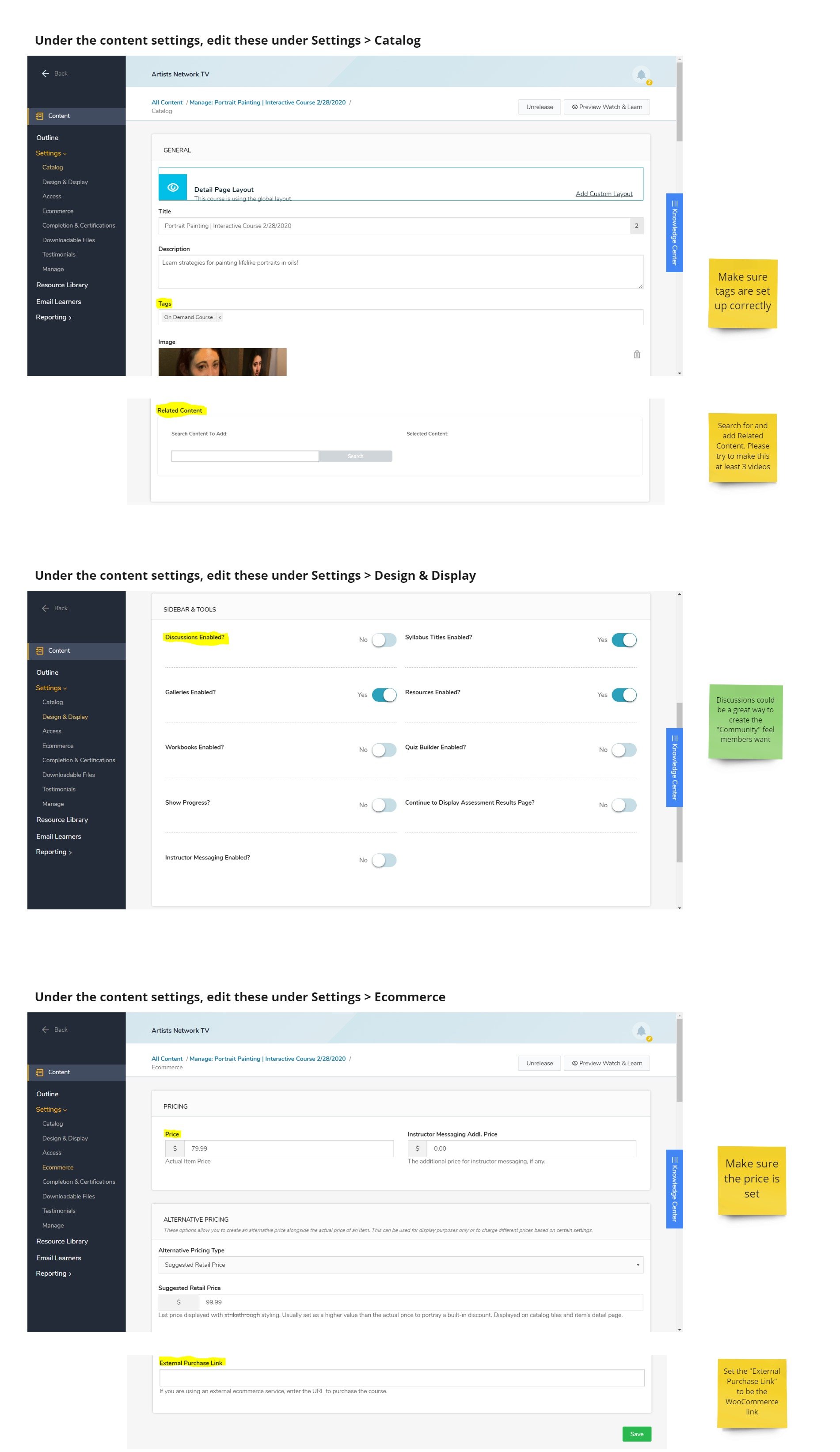
As we worked on the MVP, I documented the setup for videos in the video hosting platform and trained the Video Production and Product Management teams on the new process that would enable users to access their videos in a clearer way.
Video setup and training documentation is included in the product design section.
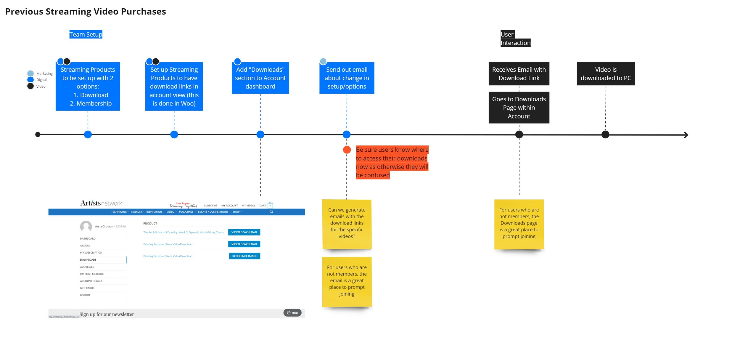
How are users accessing videos currently?
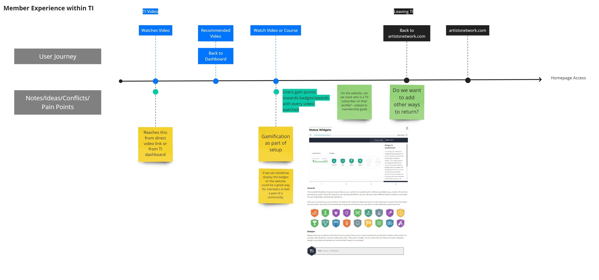
Customer Journey Maps
To better understand all the access points for videos before membership, we mapped current customer journeys.
OBJECTIVE
Highlight pain points as areas for improvement during MVP ideation
QUESTIONS TO ADDRESS
Once users enter the video platform with a subscription, how do they watch videos included in the current subscription offering?
How do users purchase and watch individual on-demand videos?
From the website, how do users navigate to their videos to pick up where they left off?
If a user watched one video on the video platform, how do they then navigate to another video? How does this change if it is one they need to purchase?


FINDINGS
Current process was not intuitive and required users to complete many steps with obvious pain points
There was no obvious link between one video and the next on the video hosting platform
There was no way for users to get back to the website from the video hosting platform, so if they chose to watch a video, they then could not access any other offerings easily
Both on-demand videos and videos included with subscription being on the same platform was incredible confusing, as there was no way for a user to know what they had access to
This helped us make the decision to remove the option for individual on-demand streaming, and instead offer these only as downloadable files. This enabled us to make the video hosting platform only accessible for members, thus reducing the confusion of what was and wasn’t included.
After examining these customer journeys, we were able to create an improved customer journey with membership option that helped reduce pain points and streamline access.

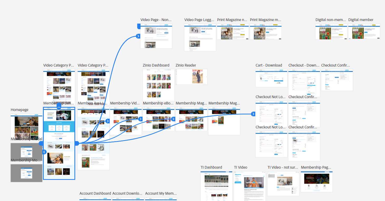
User Flows
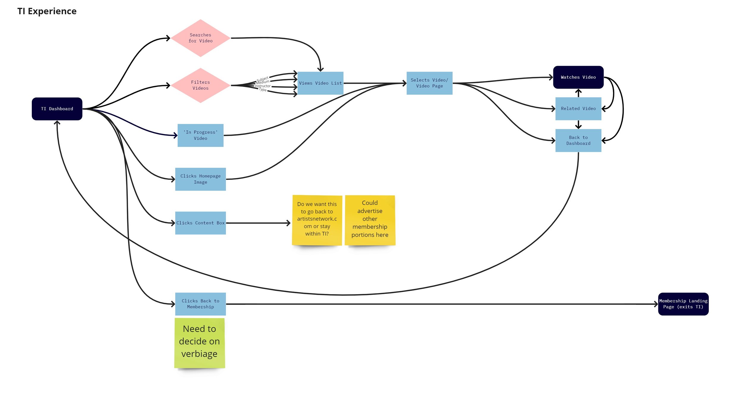
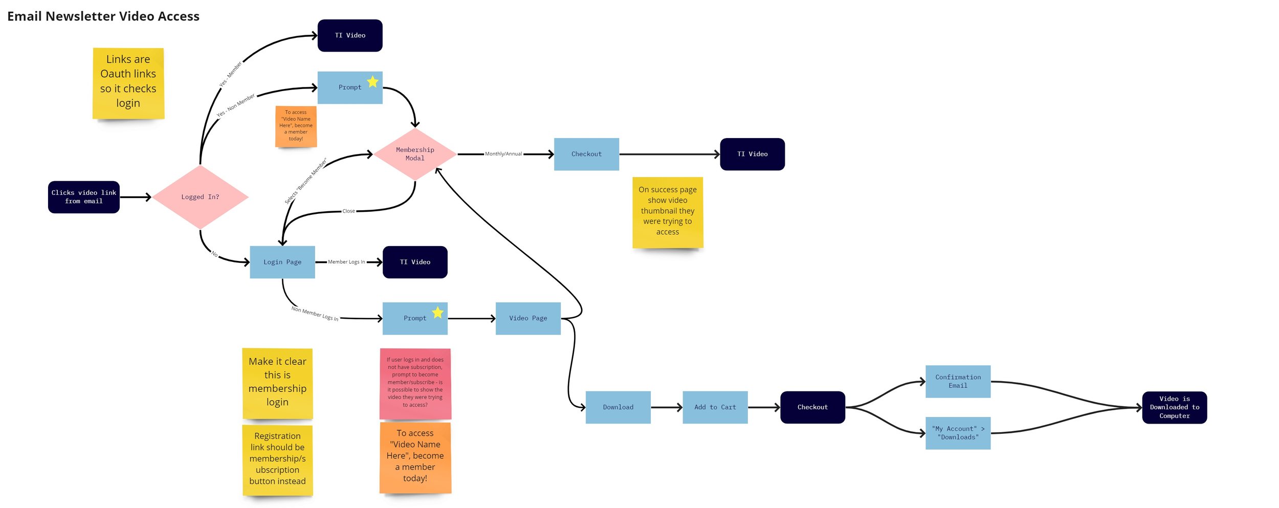
We then created new user flows to showcase access to all membership benefits, with a focus on the improved video access.
KEY CHANGES
Made sure videos were available for search on our site
Improved tagging and general UX/UI of the video hosting site to improve navigation
KEY JOURNEYS
Access to membership benefits for members
Access to on-demands videos for members and non-members
Email newsletter video links and flows for different user sets (not logged in, logged in but not a member, and logged in as a member)
KEY CONSIDERATIONS
How users would learn about membership offering
Sitewide promotional areas
Products pages included with membership to feature option for individual purchase or membership purchase
Gated content with membership upsell
Creation of Membership Benefits page with link from main navigation
How members would access membership after purchase
Creation of Members Hub
CTAs on product thumbnails and pages to “Read Now” and “Watch Now” for instant access

Design
Wireframes
I created wireframes of the video hosting platform with notes which were used to showcase the flow redesign to different teams.
Flow Redesign Example
Previously users would see an option to purchase courses within the video hosting platform, but upon clicking the button it would take them back to the course page with no purchase options available.
The redesigned flow brings users back to the Artists Network website to complete purchase.
Final Page Flows
These were presented to the teams to aid discussion and show how a user converts from a non-member to a member and how their access then differs.
Video Access with yellow section showing when the user crosses into Membership
Discounted Products for Members with yellow section showing Membership version
Page Mockups
These are examples of some of the individual page mockups created that went into the prototype.
Placeholders were used throughout the project to highlight marketing assets that were needed. Mockups were used as part of team communication to illustrate specs and where assets & verbiage would be placed.
Members Hub where members access all their benefits
Shop page showcasing easy access for logged in Members
Prototype
I created the clickable prototype using Adobe XD based on discussions with our immediate team and feedback from key stakeholders including the CEO and owner.
Prototype flows overview
Example prototype path. Due to confidentiality agreement I cannot include the whole prototype.
I presented this for review to the different teams and took their feedback into account, creating a final iteration of the prototype I then used as part of the hand-off to developers. All specs were created from this, including marketing asset requests as well as code specifications.
Team Coordination & Feature Implementation
After completing the software research and determining the main tech constraints, I began assisting with team coordination to ensure work was continuing in the background while the design and new features were being worked on.
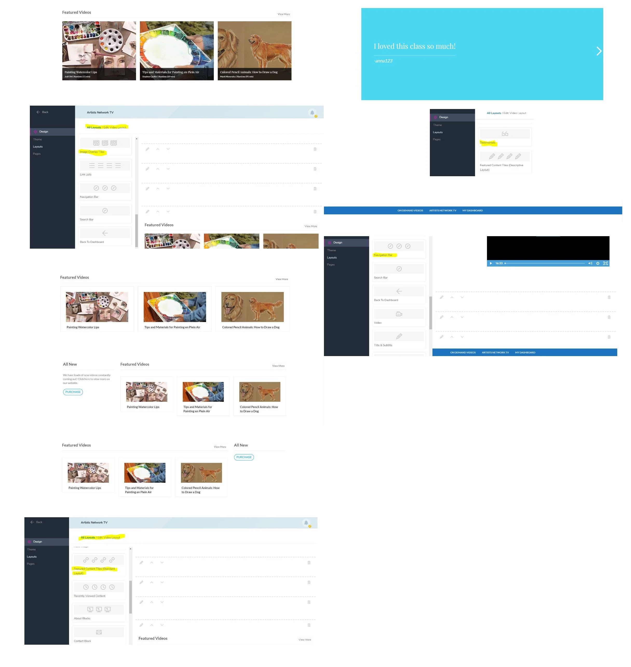
Video Setup and Training Documentation
As users were already accessing videos on the separate video platform, we had to make sure that any work we were doing would not impact them. Alongside the Project Manager on the team, I worked with the Video Production Team on a large video tagging and taxonomy initiative to ensure better search options would be available with launch.
While working on the wireframes, we documented the video setup and created training documentation from there. These were used to show the Video Production and Product Management teams all the updates that would be needed on their end. They were then able to continue work on this part of the project, while we focused on the design within the website itself.


Development
Throughout the project I met with the developers weekly and made sure to touch base with them daily through chat to ensure the designs lined up with what was possible from a tech perspective. They provided feedback as wireframes and prototypes were presented.
Development was broken into sections (including: product category pages, individual product pages, marketing across the site) and I helped lead the developers through the process from spec handoff to implementation and testing. As we did not have a front end developer on our own team at the time and were relying on an outside team of contractors, I assisted with coding many of the front end marketing items from scratch.
Product Management Team
While this was ongoing, we worked with the Product Team to improve tagging on our own site. We turned our staging site into the testing grounds for membership and made sure the products could directly link to the videos on the other platform. We created the documentation for the changes needed to products including which products were included with membership and made sure to test the ties between membership and access.
Marketing & Content Teams
I worked directly with the Marketing and Content Teams from specs I created to ensure asset creation was on schedule along with development, so as coding was being completed I could help plug in new imagery and verbiage to showcase how users would be accessing our new offerings.
Testing
Usability Testing
We conducted unmoderated remote usability testing several weeks after launch in March 2021.
Objectives
Learn what users’ impressions are of the website overall
Determine how a new site visitor would convert to membership
Learn if users are enticed by the membership offerings
Session Details
We provided screened participants with the following scenario:
“You are a working artist and are trying to develop your skills. You are especially interested in watercolor and colored pencil.”
The testing sessions included recordings of users completing tasks as well as providing both written and verbal responses to open-ended questions.
As these users were visiting Artists Network for the first time, they represent potential new users.
Software
UserTesting
Participants
Total: 5
Age: 27-33
Gender: Female, Male
Income: $20,000 - $99,999
Countries: United States
Device: Computer
Industry: Design, Fine Art
What’s Working?
Users placed high value on membership.
Users noticed Artists Network is a unique website and membership program with lots to offer artists.
Users rated this as high value and the price point resonated well with them.
Users have good recollection surrounding membership benefits.
After navigating away from where these are listed, users were able to list videos, magazines, and eBooks as being included.
Some users even mentioned exact numbers such as 850+ videos.
Users are able to find information about membership easily.
IA makes sense.
Users intuitively knew to find the information from the Membership dropdown in the top navigation or through the “Become a Member” button.
“How likely am I to become a member? Actually very! I’m going to recommend this.”
“I love the whole online education thing where it’s accessible to everybody at home, EXTREMELY reasonably. $100 a year is extremely cheap to learn all this stuff.”
Findings & Next Steps
Pain Point
Users added products included with membership to their carts as individual purchases
As there were no upsells on the cart and checkout pages, users were not aware of the savings available and would proceed with the purchase.
Opportunity
Add more membership upsells
Adding membership upsells to the product page, cart, and checkout allows users to see potential savings to help convert more users from individual purchases to membership.
This was completed as as a fast follow after testing.
Before Testing
Cart and checkout pages featured no upsells, so once added to the cart the user was not prompted to save through membership again.
Improvements After Testing
We added upsells with easy ability for users to add membership to their cart directly from the cart page if the product is included with membership or discounted for members.
Pain Point
Users were confused by the purchase options
On the video download product pages, users were confused by the "Buy Download" verbiage. Users were unsure if this added the product to the cart.
Opportunity
Redesign the Product Page to Drive Membership
By redesigning the page to make the different options clearer (individual download vs. membership) we can also drive more users to become members.
This was completed as part of the platform retheming project we did as V2 of this MVP completed in March 2022.
-

Before Testing
“Become a Member” option was clear but “Buy Download” was not. Many did not understand the product was included with membership with this UI.
-

Improvements After Testing - V2
Improved UX/UI consists of drawers the users can open by selecting that option. In testing this was much clearer and helped them understand the distinct options, along with the improved verbiage based on testing results.
Outcomes
Outcomes & Lessons Learned
We launched the MVP 2 weeks late, but with all of the features that had been required from the start. Several features got added along the way such as the capability for gated content, which we were able to figure out in the timeframe given.
In the first year, Artists Network Membership gained 10.5K+ members which was in line with expectations.
We found that the overall user experience worked, however once users went to access their videos on the separate platform they would get confused. This is understandable and unfortunately was not something we could change as we had signed a multi-year contract with that software company. We were able to solve these issues at a later date during a retheming effort towards the end of the contract.
We did not launch with a trial, which many users expressed interest in as they wanted to try it out before purchasing. Users also expressed understanding the membership benefits when they came across them, but had no upsells at cart or checkout to remind them they would have a better deal if they purchased membership instead. After usability testing helped us gather these insights, we were able to act on them quickly to provide trials as well as cart and checkout upsells for membership.


